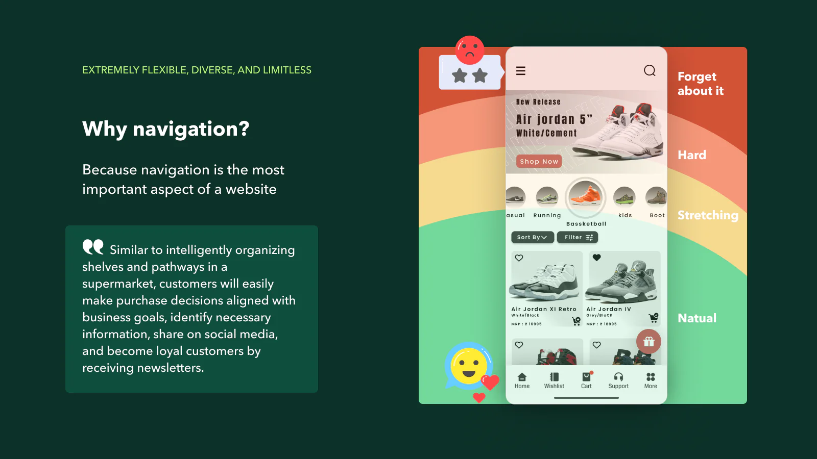
Introduction to Mobile Navigation
In the fast-paced world of e-commerce, ensuring a seamless user experience on mobile devices is crucial. One of the key elements in achieving this is optimizing navigation on your Shopify site. Effective mobile navigation allows users to effortlessly find products, access information, and complete purchases, enhancing their overall experience. This blog post explores strategies to optimize navigation for mobile Shopify sites, ensuring your customers can navigate your store with ease.
Benefits of Optimized Navigation for Mobile Users
Optimized navigation on mobile devices offers several benefits:
- Improved User Experience: Simplified navigation helps users find what they’re looking for quickly and easily, reducing frustration and enhancing satisfaction.
- Increased Conversion Rates: When users can navigate your site effortlessly, they are more likely to complete purchases, leading to higher conversion rates.
- Lower Bounce Rates: Effective navigation keeps users engaged and encourages them to explore more pages on your site, reducing bounce rates.
- Enhanced SEO: Google prioritizes user-friendly sites in its search rankings. Optimized mobile navigation can improve your Shopify site’s SEO, driving more organic traffic.

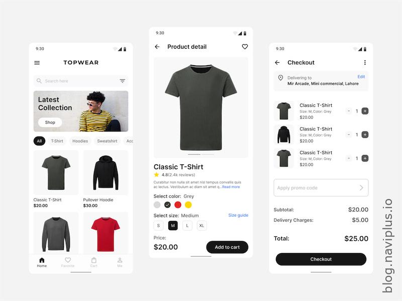
Implementing a Hamburger Menu
The hamburger menu, represented by three horizontal lines, is a popular choice for mobile navigation. It conserves valuable screen space and provides a clean, uncluttered interface. Here’s how to implement it effectively:
- Visibility: Place the hamburger menu in a consistent, easily accessible location, typically at the top-left or top-right corner of the screen.
- Animation: Use smooth animations when opening and closing the menu to enhance user experience.
- Content Prioritization: Organize the menu with the most important links at the top, ensuring users can quickly access key sections like product categories, the shopping cart, and contact information.
Sticky Navigation and Its Advantages
Sticky navigation, which remains fixed at the top of the screen as users scroll, offers several advantages for mobile sites:
- Constant Accessibility: Important navigation links are always available, reducing the need for users to scroll back to the top.
- Improved Usability: Sticky navigation makes it easier for users to switch between sections, enhancing the overall usability of your site.
- Increased Engagement: By keeping navigation elements visible, users are more likely to explore different parts of your site, increasing engagement.
When implementing sticky navigation, ensure it doesn’t take up too much screen space, especially on smaller mobile devices. Use minimalistic design elements to maintain a clean look.

Best Practices for Clear and Concise Menu Labels
Effective navigation relies on clear and concise menu labels. Follow these best practices to optimize your mobile Shopify site’s menu:
- Simplicity: Use simple, straightforward language for menu labels. Avoid jargon or overly technical terms.
- Brevity: Keep labels short and to the point. Long labels can be difficult to read on small screens.
- Categorization: Group related items under common categories to help users find what they’re looking for quickly.
- Consistency: Use consistent terminology across your site to avoid confusing users.
- Icon Usage: Supplement text labels with intuitive icons to enhance understanding and accessibility.
Conclusion and Practical Tips
Optimizing navigation for your mobile Shopify site is essential for providing a seamless shopping experience. Here are some practical tips to get started:
- Test and Iterate: Regularly test your mobile navigation with real users to identify pain points and areas for improvement.
- Analytics: Use analytics tools to track user behavior and understand how visitors navigate your site. Use this data to make informed decisions.
- Feedback: Encourage user feedback on your mobile navigation and use it to refine and enhance the user experience.
By focusing on mobile navigation, you’ll create a more user-friendly, engaging, and successful Shopify site. Prioritize clear and concise labels, consider the benefits of sticky navigation, and utilize the hamburger menu to optimize the browsing experience for your mobile users. This approach will not only improve user satisfaction but also drive higher conversion rates and better SEO performance for your online store.