Introduction to Mobile-First Design
In the world of e-commerce, having a website that is optimized for mobile devices is no longer optional; it’s a necessity. A mobile-first design approach ensures that your Shopify website delivers a seamless user experience on smartphones and tablets before scaling up to larger screens. This method prioritizes the mobile user experience, making it easier to navigate, faster to load, and more engaging for users on-the-go.

Importance of Mobile-First in Today’s E-Commerce Landscape
The shift towards mobile-first design is driven by the growing number of consumers who use their mobile devices to shop online. Statistics show that more than half of global web traffic comes from mobile devices. For e-commerce businesses, this trend underscores the importance of optimizing for mobile to increase accessibility, enhance user experience, and boost conversion rates. A mobile-first Shopify website design not only helps in capturing this vast audience but also improves your site’s search engine ranking, as Google favors mobile-friendly websites in its search results.

Key Principles of Mobile-First Design
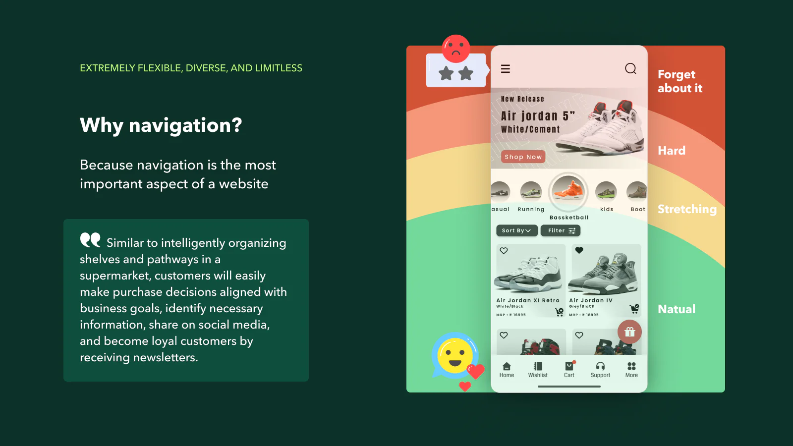
Simplified Navigation
Design with touch interactions in mind. Use easily tappable buttons and clear, concise menus.
Fast Load Times
Optimize images, use compressed files, and leverage lazy loading to ensure your site loads quickly on mobile networks.
Readable Text
Choose fonts and sizes that are legible on small screens, and ensure sufficient contrast for readability.
Responsive Design
Ensure your site adjusts gracefully to different screen sizes, maintaining usability and aesthetics.
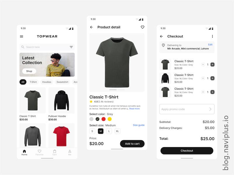
Prioritized Content
Showcase the most important content first, and use collapsible sections for less critical information.
Selecting and Customizing Mobile-First Shopify Themes

Shopify offers a variety of themes that are designed with a mobile-first approach. When selecting a theme, consider:
- Responsiveness: Ensure the theme looks great on all devices.
- Customization Options: Look for themes that allow easy customization to match your brand.
- Speed: Choose themes known for their fast load times.
Customizing your theme involves tweaking the layout, fonts, colors, and images to align with your brand identity while keeping mobile users in mind. Utilize Shopify’s theme editor and developer tools to make these adjustments efficiently.
Examples of Successful Mobile-First Shopify Stores
Allbirds
Allbirds’ Shopify store is a stellar example of mobile-first design. Their site features a clean, simple interface with easy navigation, fast load times, and large, tappable product images.

Gymshark
Gymshark’s mobile site is optimized for quick access to products and categories. It uses high-quality images and streamlined checkout processes to enhance the mobile shopping experience.
Kylie Cosmetics
Kylie Cosmetics utilizes a mobile-first design with intuitive navigation and a visually appealing layout that ensures a smooth shopping experience on smartphones.

Conclusion and Key Takeaways
Adopting a mobile-first approach for your Shopify website design is crucial in today’s e-commerce environment. It enhances user experience, boosts engagement, and improves SEO. Key takeaways include:
- Prioritize mobile users in your design strategy.
- Focus on simplified navigation, fast load times, readable text, and responsive design.
- Select and customize Shopify themes that support mobile-first principles.
- Learn from successful mobile-first Shopify stores to inspire your design.
By focusing on mobile-first design, you’ll be better positioned to capture and retain the growing number of mobile shoppers, ultimately driving more sales and growth for your business.