Website navigation is more than just a feature—it’s a cornerstone of a good website. This isn’t just an opinion, but a fact backed by research. A study conducted by Top Design Firms found that 38% of consumers pay attention to a page’s navigational links and its layout when visiting a site for the first time. This statistic underscores the value of well-structured website navigation.
Understanding the significance of navigation is simple — it’s a key factor that can make or break a user’s experience. Visitors naturally gravitate towards sites that adhere to website navigation best practices. Why? Because a well-laid navigation system can help them find the information they’re seeking quickly and effortlessly. Therefore, navigation isn’t just a minor detail — it’s a crucial part of the user experience and should be a central consideration in your website strategy.

In this comprehensive guide, we’re going to dig deeper into the concept of website navigation design. Our aim is to help you craft a navigation system that caters to the needs and expectations of your visitors. We’ll discuss the best practices for website navigation, providing a roadmap for optimizing your site’s navigability.
But there’s more. We’ll also provide a review of various website navigation examples, taking a closer look at what makes them effective. These examples will not just serve as inspiration, but will also highlight key design elements that contribute to superior navigation.
Lastly, we’ll explore the must-haves for effective website navigation design. These essential elements will ensure that your website isn’t just navigable, but user-friendly and intuitive as well. So, buckle up and get ready for a deep dive into the world of website navigation.
What does Shopify store navigation contain?
Shopify store navigation typically contains the following elements:
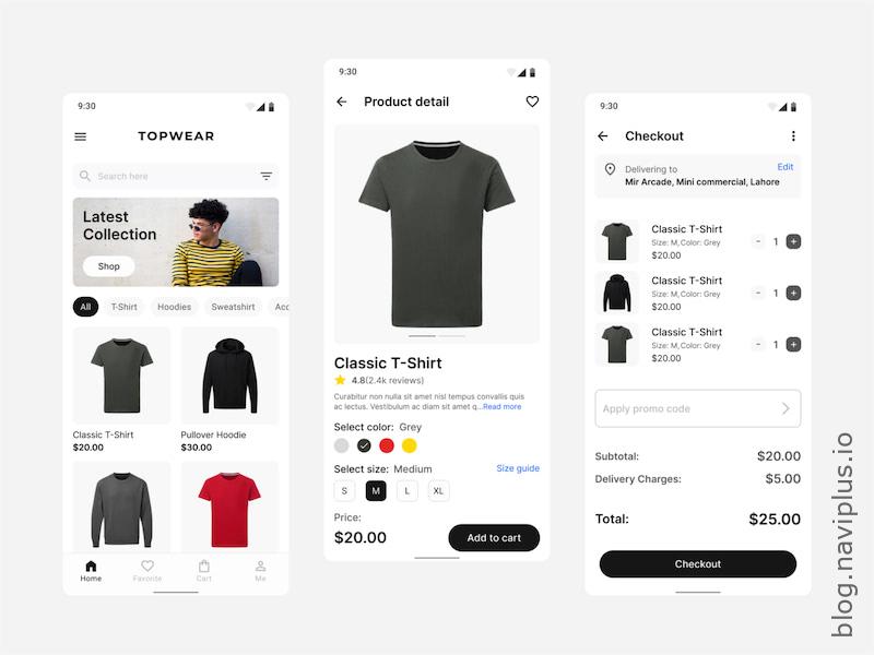
- Home: The “Home” link is a staple in every Shopify store navigation. It serves to lead users back to the main page of the store. After browsing through different pages, users can easily return to the homepage by clicking on this link.
- Products/Collections: These links direct users to different product categories or collections that the store offers. They make it easier for customers to browse based on their interests or the specific items they’re looking for.
- About us: The “About us” page is a crucial part of the store. It provides information about the store, its mission, and its owners. This page helps build trust and connection with the customers by providing them with insights about who they’re buying from.
- Contact us: This page is important for customer service. It provides contact information for the store, including email, phone number, and sometimes a physical address or a contact form. It gives customers a direct line of communication for any inquiries or concerns.
- FAQ: The “FAQ” or Frequently Asked Questions page is a helpful resource for customers. It answers the most common queries about the store’s products, policies, shipping, returns, and more. This can save both the customer and the store a lot of time.
- Blog: If the store maintains a blog, a link will be provided in the navigation. Blogs are a great way for stores to share news, product updates, tips, and other relevant content. This can also help with the store’s SEO.
- Cart: The “Cart” is where users can view the items they’ve added to their shopping cart. It allows customers to review their selected items, make modifications, and proceed to checkout when they’re ready to make a purchase.
Each of these elements plays a vital role in creating a user-friendly and efficient navigation system for a Shopify store.

In addition to the aforementioned elements, there are a few more features that a Shopify store navigation might include:
- Shopify Search Bar: A search bar is an essential tool for any online store. It allows users to quickly find the products they’re looking for by typing in keywords related to the items.
- Sign In/Account: This link gives users access to their personal account information. Here, customers can view their order history, save favorite products, and manage their shipping and billing information.
- Privacy Policy/Terms of Service: Typically found in the footer, these pages provide important legal information about the store’s operations, including the handling of customer data and the terms for using the website.
- Promotional Banners: Some stores incorporate promotional banners in their navigation. These banners highlight sales, special offers, or important news about the store.
- Wishlist: A wishlist allows customers to save products they’re interested in but may want to purchase at a later time. This feature can enhance the shopping experience by making it easier for customers to keep track of their desired items.

These additional features further enhance the user experience, making the site more accessible and user-oriented.
What is Shopify Store Navigation Missing?
Shopify Bottom Bar / Tab Bar:
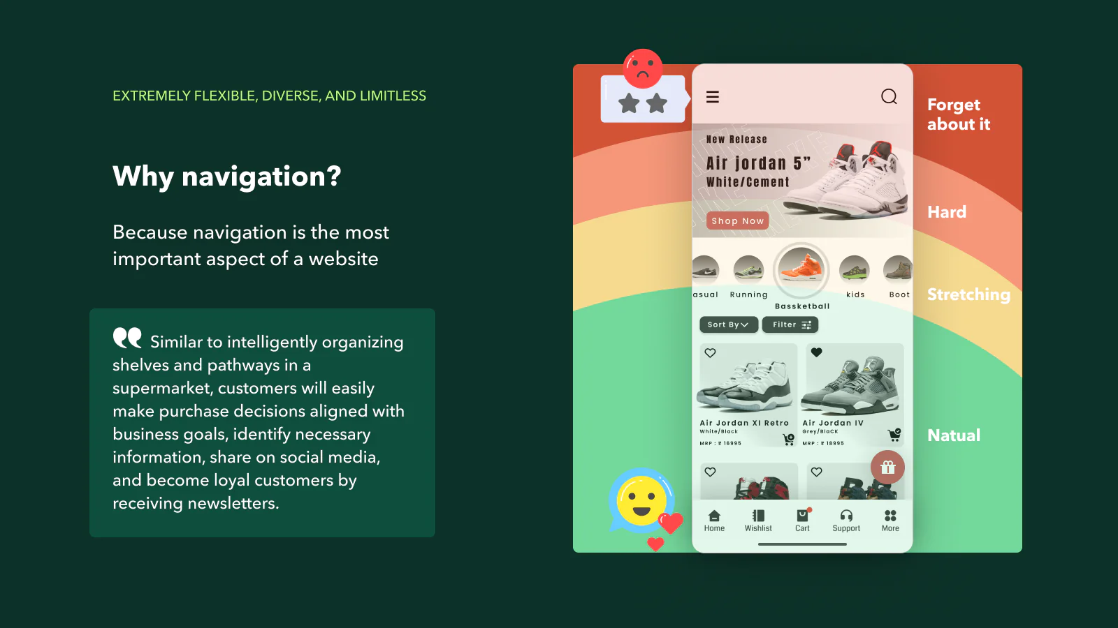
A Bottom Bar or Tab Bar is a navigational component frequently observed in the design of mobile interfaces. It is a static element that is placed at the bottom of the screen and remains visible and accessible as users navigate through different parts of a website or mobile application. The bottom bar provides direct links to key areas or functionalities of the platform, serving as a roadmap to guide users. On a Shopify store, for instance, this could include tabs such as ‘Home’, ‘Categories’, ‘Cart’, ‘Wishlist’, or ‘Account’.
The primary importance of a Bottom Bar or Tab Bar lies in its accessibility and ease of use. As it’s located at the bottom of the screen, it falls within the natural reach of the thumb when a user is holding a mobile device. This strategic placement ensures that users can effortlessly navigate through the website or app, making the user interface more intuitive and user-friendly.
In addition, the Bottom Bar allows for quicker navigation by enabling users to switch between different sections of the site without the need to return to the home screen each time. This feature can greatly enhance the efficiency of the user’s journey through the site, reducing unnecessary steps and saving time.
The Bottom Bar also contributes to the overall user experience by improving the structure and clarity of the website or app. It provides a clear path that users can follow, reducing the likelihood of confusion or frustration. This is especially beneficial for first-time visitors who may not be familiar with the site’s layout.
Moreover, the Bottom Bar plays a significant role in conversion rates. By facilitating easy and efficient navigation, it helps keep users engaged and encourages them to explore more of what the website or app has to offer. This increased engagement can lead to higher user retention rates, more page views, and ultimately, more conversions or sales.
In conclusion, while the Bottom Bar may appear to be a simple design element, it carries substantial weight in shaping the user experience, enhancing website navigability, and driving key performance indicators such as conversion rates.

Shopify Mega Menu:
A Mega Menu is an expanded dropdown menu that displays multiple options in a two-dimensional layout. It is typically activated when a user hovers over a link or defined area. This type of menu is particularly useful in ecommerce websites, such as Shopify stores, because it can accommodate a large number of options, including images and other rich media.
The importance of a Mega Menu lies in its ability to improve navigation drastically. By presenting all available options at once, it allows users to see everything at a glance without having to scroll through a long list of links. This makes it easier for users to find what they’re looking for, enhancing their experience and potentially increasing conversion rates. Furthermore, Mega Menus can also assist in site SEO as they allow for the inclusion of more keywords and internal links.

Shopify Contact tools:
Contact tools refer to various methods through which customers can get in touch with the store for inquiries, support, or feedback. These could be communication channels like email, social media, phone, or live chat, and even tools like contact forms or feedback forms.
Contact tools are crucial for providing excellent customer service. They allow customers to easily reach out to the store for any concerns, questions, or assistance they might need. This can enhance the customer experience and build trust, as it assures customers that help is readily available if they encounter any issues or difficulties. Furthermore, contact tools also provide valuable customer insights that can be used to improve products, services, and overall user experience.

Shopify Float button:
A Float button, also known as a floating action button, is a button that appears over the content and is designed to promote the primary action of the web page or app. In the context of a Shopify store, a floating button could be used for a variety of purposes, such as a quick access button to the shopping cart, a “back to top” button, or a “help” button that opens a chat with customer service.
The importance of a Float button lies in its high visibility and easy access, regardless of where the user is on the page. As such, it can significantly enhance the user experience and increase conversions by encouraging the user to take the desired action. It’s a small design element that can have a big impact on the functionality and user-friendliness of a site.
Why Navi+ Design packs is an important piece for Shopify Navigation.
Navi+ LEADS your visitors according to your purpose with easy-to-customize navigation design packs: Bottom bar, Tab bar, Mega menu, and free contact tools… See a demo of Navi+ Design pack here, for more information, click here.
Navi+ Powerful toolkit that enables to create various navigations: Bottom & Tab bar, Menus, Float buttons
Enhance your business efficiency by comprehensive website navigation improvement. This is a powerful and user-friendly toolkit that enables you to create various navigation styles such as Tab bar, Drawer, Rail, Float button, and Menu, catering to each user’s specific needs. Why? Because navigation is the most important aspect of a website? Similar to intelligently organizing shelves and pathways in a supermarket, customers will easily make purchase decisions aligned with business goals.
- Transform your store to be as user-friendly as a mobile app by several clicks
- No need for design or technical knowledge, just drag and drop
- Extremely flexible, diverse, and limitless
- Run extremely lightweight, continuously optimized, and never-conflict
- Daily measurement, user understanding, and easy A/B testing