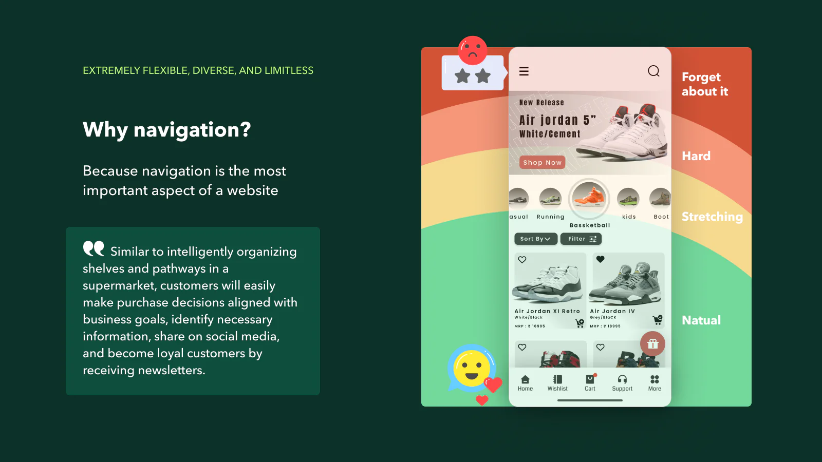
Website navigation is more than just a nice-to-have element; it is a crucial component that can significantly determine the success of a website. This statement isn’t just a mere opinion; it’s backed up by research. A study conducted by Top Design Firms reveals that 38% of consumers place importance on a page’s navigational links and layout when they visit a website for the first time. Here’s how to improve the navigation of your Shopify website to a number one market position?
The role of navigation in a website’s overall experience cannot be overstated. It’s an integral part that plays a massive role in shaping user behavior. Visitors have a natural inclination towards websites that follow website navigation best practices. The reason is simple: effective navigation design helps users find the information they’re seeking quickly and effortlessly.
In the digital landscape where every second count, an easy-to-navigate site is a powerful tool that can keep your visitors engaged, reduce bounce rates, and ultimately, increase your website’s conversion rate. Therefore, website navigation is not just a part of the user experience; it is a critical element of your wider website strategy.

In this comprehensive guide, we will delve deeper into the world of website navigation design. Our aim is to provide you with practical insights to create a navigation system that aligns with your visitors’ needs and expectations. To start, we will discuss the fundamental principles of website navigation, outlining the best practices that have proven effective across different industries.
Next, we’ll walk you through several examples of website navigation. We believe that drawing inspiration from successful cases is a great way to understand how to apply the principles of effective navigation design. Lastly, we’ll identify and explore the key elements that every website should incorporate to ensure a user-friendly design.
The journey to creating an effective navigation system for your website starts here. So, let’s get started.
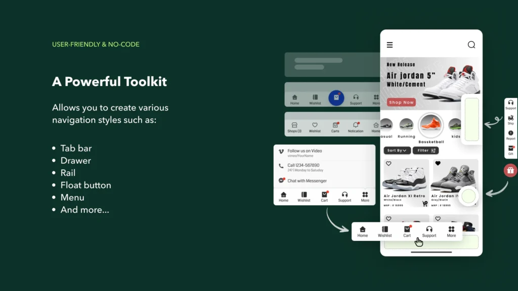
There are several types of Shopify website navigation:
Main navigation is a fundamental component of a website’s structure. It usually resides in the header section of a website and includes links to the most crucial and frequently visited pages. These pages could include the home page, about us section, services or product listings, blog, contact information, and more.
The main navigation serves as a roadmap for your website, guiding visitors to the content they are seeking. It helps to enhance the user experience by allowing them to navigate the website effortlessly and find the information they are looking for without wasting time. This not only improves the site’s usability but also contributes to its SEO performance.
A well-designed main navigation is intuitive and aligns with the expectations of the website’s visitors. It’s designed with the user’s needs in mind, ensuring that it’s user-friendly and easy to understand. Moreover, the main navigation should be consistent throughout the website, providing a sense of familiarity and predictability that enhances the overall user experience.

In conclusion, the main navigation is more than just a collection of links; it’s a critical element of your website’s design and functionality. As such, it should be thoughtfully designed and implemented to ensure it effectively serves its purpose – helping your visitors navigate your website easily and efficiently.
- Shopify Footer Navigation: This is found at the bottom of a website and often includes links to legal information, contact pages, and social media.
- Shopify Side Navigation: This is often used for websites with a lot of content and can be either on the left or right side of the website.
- Dropdown Navigation: This is used when there are multiple sub-pages under a main page.
- Breadcrumbs Navigation: This type of navigation shows users their current location in relation to the site’s hierarchy.
- Shopify Mega Menu Navigation: This type of navigation handles large site structures by showing all options in one main, dropdown panel.
- Sticky Navigation: Also known as fixed or persistent navigation, this type of navigation stays visible as a user scrolls down the page. It’s beneficial because it allows users to access the menu from anywhere on the site without having to scroll back to the top.
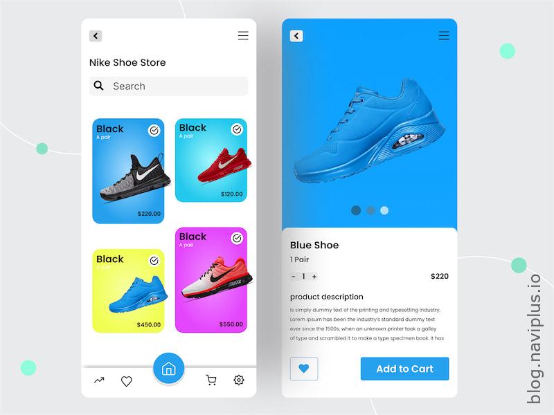
- Hamburger Menu: This type of navigation is common on mobile sites. It’s usually represented by three horizontal lines and when clicked, it reveals the main navigation items.
- Fat Footer Navigation: This is a larger version of footer navigation that covers more than just one column at the bottom of a website. It often includes contact information, social media links, and other important links that didn’t fit in the main navigation.
- Utility Navigation: This is a secondary navigation system that typically includes links like “Contact Us”, “FAQ”, “Help”, and “Login”. It’s usually located at the top of the website and is meant to provide users with quick access to important links.
In conclusion, the type of navigation you choose for your website should depend on the amount and type of content, the audience’s needs, and the overall goal of the website. Effective website navigation is user-friendly, intuitive, and aligns with the expectations of your audience. It’s also consistent throughout the website, making it easier for visitors to find what they’re looking for.
How to improve the navigation of your Shopify website to a number one market position?
Improving Shopify navigation can be achieved through several means:
- Simplify Navigation: Ensure that your main navigation is simple and intuitive. Include only the essential links that direct users to the most important pages of your website.
- Use Descriptive Labels: Use clear and descriptive labels for your navigation menus. This will help users understand what they will find when they click on a link.
- Implement a Search Feature: A search function can be a powerful tool, especially for e-commerce sites with a large number of products. This allows users to find specific items without having to navigate through multiple pages.
- Make Use of Dropdown Menus: If your site has a lot of content, consider using dropdown menus. This allows you to include more links without overwhelming the user.
- Responsive Design: Ensure that your site’s navigation is as easy to use on mobile devices as it is on desktop computers. This could mean implementing a hamburger menu on mobile versions of the site.
- Use Breadcrumbs: Implementing a breadcrumb trail helps users understand their location within your website and allows them to navigate back to previous pages easily.
- Utilize Sticky Navigation: A sticky navigation bar that stays at the top of the page as users scroll can improve the user experience by making navigation accessible at all times.
By improving your Shopify site’s navigation, you can enhance the user experience, reduce bounce rates, and potentially increase conversion rates.
- Consistency is Key: Ensure that your navigation is consistent across all pages of your website. This makes it easier for users to understand and use your site’s navigation system, as they know what to expect when moving from page to page.
- Include a Site Map: A site map provides a quick overview of the site’s content and allows users to navigate to any part of the site in one click. This is particularly useful for large websites with a lot of content.
- Prioritize Key Pages: Highlight your key pages in your navigation. For instance, if you’re running an e-commerce store, make sure that your product categories are easy to find in the main navigation.
- Use High Contrast for Navigation Items: Make sure your navigation items stand out from the rest of the site. This can be achieved by using contrasting colors or bold fonts for your navigation items.
- Limit the Number of Navigation Items: Too many items in the navigation menu can overwhelm users. As a rule of thumb, it’s best to limit your main navigation to about 7 items.
- Test Your Navigation: Finally, remember to test your navigation structure. This can be done by conducting user testing, where you observe how users interact with your navigation and make adjustments based on their feedback.

By implementing these strategies, you can create a powerful and user-friendly Shopify navigation system that helps users find what they’re looking for quickly and effortlessly, thereby improving the overall user experience.