Improving the mobile version of a Shopify store can be achieved through a variety of strategies:
- Shopify Mobile-first approach: This approach prioritizes mobile users and optimizes the mobile version of the store before the desktop version. This ensures a seamless shopping experience for the majority of online shoppers who use mobile devices.
- Responsive design: Although this is a desktop-first approach, it ensures that the website layout adjusts according to the screen size, providing a seamless experience for users on any device.
- Use of a native app: While mobile web is easier to improve with a native app, the app can provide a superior user experience as interface components are designed to be closer to the user’s hand.
- Use of tools such as Navi+: This tool allows for easy modification of Shopify navigation with a simple drag & drop feature, and it doesn’t require knowledge of coding. Moreover, it’s a cost-effective solution as it combines several apps and sessions.

Remember, the end goal is to enhance the user experience on mobile, leading to increased engagement and conversions.
Why the mobile version is much more important than the desktop
The mobile version of a website is crucial because it directly impacts the user experience for the majority of users. As of 2021, over 50% of global web traffic comes from mobile devices. This trend is only expected to continue, with mobile usage projected to keep rising in the future. As such, businesses can’t afford to neglect their mobile sites. Mobile versions of websites need to be fast, easy to navigate, and offer all the functionality of the desktop version. If these aspects are not met, the business risks losing potential customers who have a poor experience and turn to competitors with better mobile versions. Therefore, prioritizing the mobile version of a website is a key strategy for online businesses.

Many online sellers often make the mistake of either adopting a mobile-first approach or a responsive (desktop-first) design without considering the unique needs of their audience. It’s important to understand the difference between the two.
A mobile-first approach to Shopify means the primary design and development focus is on the mobile version of the online store. Everything is optimized for mobile users first before being adapted for desktop use.
On the other hand, a responsive Shopify design, which is in fact a desktop-first approach, means the layout adjusts according to the screen size. It provides a seamless experience regardless of the device but the primary focus remains on the desktop version.
Mistake of 80% of online sellers. Mobile first or responsive (desktop first)?
What is Shopify mobile first?
Shopify mobile-first is an approach to design and development where the primary focus is on optimizing the mobile version of an online store. This approach ensures that everything from layout to navigation is first optimized for mobile users. After that, the design is adapted for desktop use. This strategy prioritizes the increasing number of users who shop on their mobile devices, ensuring they have a seamless and enjoyable shopping experience.

What is Shopify responsive? In fact, it’s desktop first
Shopify responsive design, which is actually a desktop-first approach, means that the primary focus is on optimizing the online store for desktop users. The layout, navigation, and other elements are first designed for desktop use. After that, the design is adjusted to fit different screen sizes, providing a seamless experience for users regardless of the device they use. Even though this approach ensures compatibility with all devices, it prioritizes the experience of desktop users. It’s often used by businesses whose audience primarily shops on desktop computers. However, with the increasing trend of mobile shopping, businesses might want to reconsider this approach and adopt a mobile-first strategy instead.

The difference between Shopify mobile native app and mobile web?
- Native applications provide a superior user experience as they are specifically designed and optimized for mobile devices. The interface components in native applications are designed with the user’s ease of access in mind, making it more intuitive and user-friendly.
- Unlike web-based applications, native applications are designed with a mobile-first approach. This means they are primarily designed for mobile devices, ensuring optimal performance and user experience on smartphones and tablets.
- Additionally, it is easier to enhance the features and performance of mobile web services when using a native app. This is due to the direct access to device hardware and operating system features, which allows for more possibilities in terms of functionality and user experience enhancements.
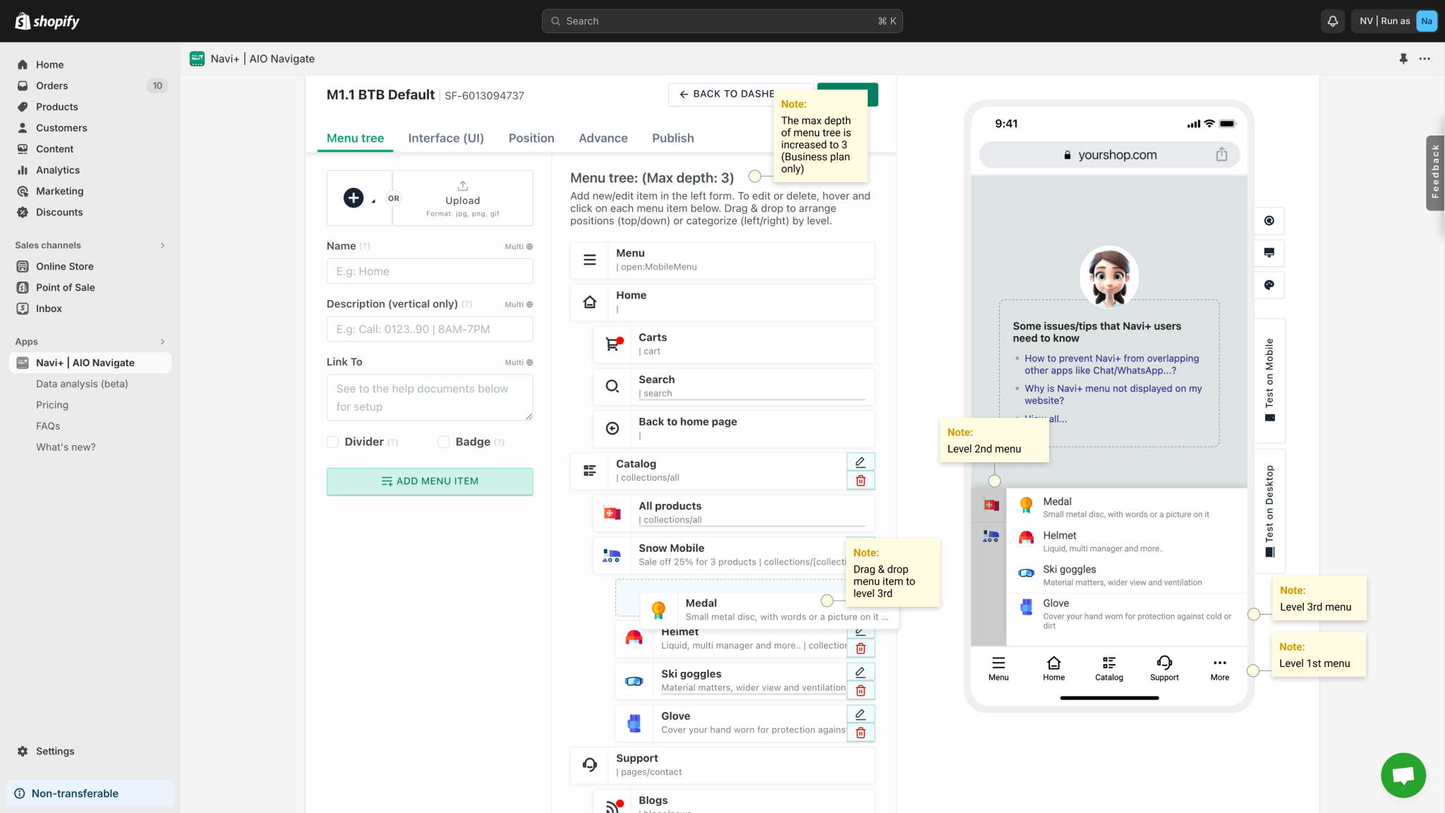
How to easily improve your Shopify mobile version? Navi+ is a solution.
What is Navi+?
Navi+ is powerful toolkit that enables to create various navigations: Bottom & Tab bar, Menus, Float buttons
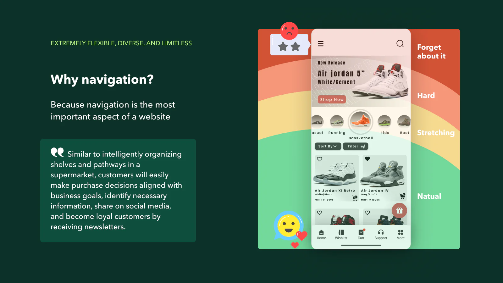
Enhance your business efficiency by comprehensive website navigation improvement. This is a powerful and user-friendly toolkit that enables you to create various navigation styles such as Tab bar, Drawer, Rail, Float button, and Menu, catering to each user’s specific needs. Why? Because navigation is the most important aspect of a website? Similar to intelligently organizing shelves and pathways in a supermarket, customers will easily make purchase decisions aligned with business goals.

- Transform your store to be as user-friendly as a mobile app by several clicks
- No need for design or technical knowledge, just drag and drop
- Extremely flexible, diverse, and limitless
- Run extremely lightweight, continuously optimized, and never-conflict
- Daily measurement, user understanding, and easy A/B testing
What does Navi+ help you do?
- Bring the interface components closer to the user’s fingers, making it more user-friendly and intuitive.
- Realize substantial cost savings as it is a comprehensive collection of various apps and sessions, providing an all-in-one solution.
- Effortlessly modify your Shopify Navigation using the simple drag and drop feature, providing seamless navigation adjustments.
- There’s absolutely no need for you to have coding knowledge, making it accessible for users of all technical levels.
- Plus, there are numerous other benefits and features that enhance the functionality and usability of your platform.