What is this template?
This is a bottom bar (also sometimes called a tab bar, navigation bar..), it’s a small menu that is permanently located at the bottom of the mobile screen. This is one of the essential components that must be present in mobile applications, if it is made as a native app (also known as an application). Because this is the area with the best experience for mobile users, it’s closest to the fingers, therefore, it’s easily tapped and navigated.
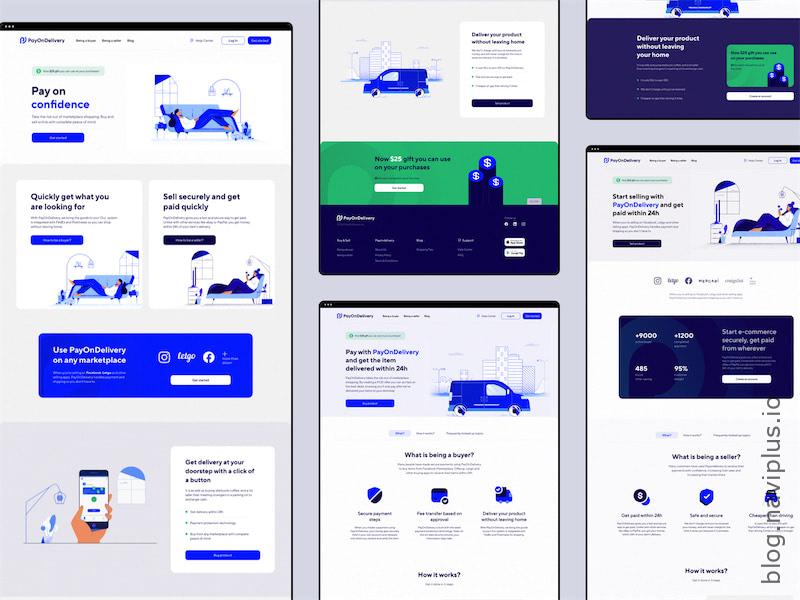
Navi+ is a powerful and user-friendly toolkit that enables you to create various navigation styles such as Tab bar, Drawer, Rail, Float button, and Menu, catering to each user's specific needs
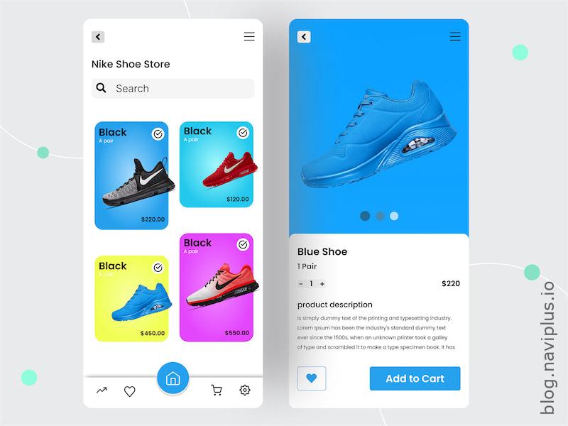
M1.1 is a default bottom bar, most popular, works perfectly with most Shopify themes, such as Dawn, Spotlight.. as well as premium themes. The style of M1.1 is Minimalistic, also known as Simplicity. White and black, thin icons, thin fonts, moderate curve and shadow. This is a suitable template for you to apply to most websites that want to focus the user’s gaze on product images, prices, and eye-catching sales programs.
Perfectly Compatible
M1.1 is perfectly compatible with all Shopify free themes, with the ability to work with website components. You can completely replace the entire navigation system of the website with Navi+, making the website look very native app, professional and easy to navigate.
- Main menu: You can use a Navi+ menu item to open the main left menu, replacing the website’s default hamburger menu.
- Search bar: You can use a Navi+ menu item to open the Search bar. This makes the magnifying glass on the header unnecessary.
- Cart bar: You can use a Navi+ menu item to open the Cart bar. Furthermore, you have the option to update the quantity of items in the shopping cart on the Navi+ menu item. This makes the bell on the header unnecessary.
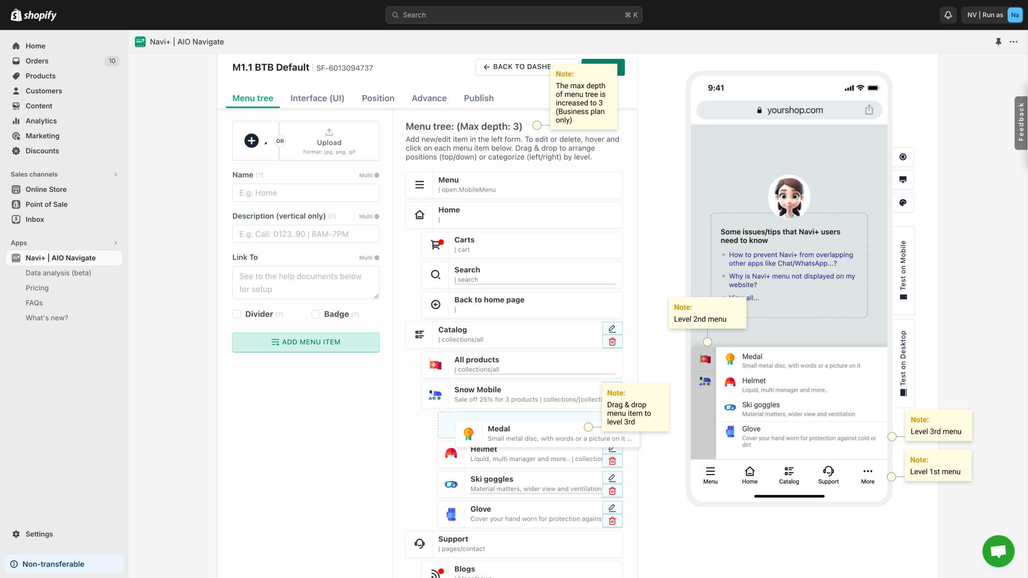
- Bring your entire product catalog up to the Navi+ menu, with images, name + description and a maximum of 3 layers of menus.
- Shopify Inbox: You can use a Navi+ menu item to turn on the default and free chat program from Shopify, which is Shopify Inbox, this helps your website reduce a chat icon hanging at the bottom right corner, making room for sales programs, lucky spin or sale off.
- Interface: You have all the easy tools to configure the interface of Navi+, background color (darkmode/light mode), icon and text color, spacing, size, padding and margin… without knowing anything about code.
- Coexist with other applications: You can configure the display position of Navi+ and padding, margin to be able to work together with other hanging applications (like chat) without overlapping each other. In addition, you can use z-index to arrange the display order of Navi+ compared to other components/applications.
- CSS: If you are someone who knows how to use CSS, you can completely add codes to help customize the interface of Navi+ entirely according to your liking and suitable for the style of the website.
- Javascript: If you are someone who knows how to use Javascript, you can completely add codes to help the website turn on/off pages, bars, debug..
Hide/Show on one or more pages
Navi+ has many tools and options to help you hide/show Navi+ menus as needed on pages
- You can show on all statuses or select from the list of Shopify pages by group: Home, products, categories, pages, blogs…
- You can embed Navi+ as a session in the theme to show on any page you want
- You can configure to show on mobile, desktop or both.
- You can provide a list of keywords, the application will check, if that keyword appears/does not appear on the url of the page, Navi+ will be shown/not shown
How to use?
Experience it, there are many interesting things waiting for you with Navi+. Your creativity will be unleashed when using the product and don’t let anyone impose. However, each Navi+ menu will have some settings, you should understand it briefly here.
- Menu tree: This is the most important part of Navi+, including a menu tree with many levels (maximum is 3), you can drag and drop to arrange, set parent-child order for menu items. Click to add menu item or edit information, delete menus.
- Interface (UI): You can change all about the UI such as background color (darkmode/light mode), icon and text color, spacing, size, padding and margin… without understanding anything about code. Here Navi+ allows you to set up for level 1 and level 2/3 separately, helping to maximize the experience for your customers.
- Position: You can set up to display on mobile/desktop or both. For each platform, you can choose the display position: below, above, right, left…
- Advance: For those who understand coding, you can configure CSS, Javascript and z-index


Contact us
If there is anything you do not understand, do not hesitate to chat with us, we will reply immediately if we are currently online or will reply later but we will always reply. Most customers who chat with us are satisfied. The 5/5 rating after 6 months of golive, the title “Built for shopify” and being present at Shopify Marketplace Spotlight have shown that.
Best regards,
Phạm Khôi.