In the ever-evolving world of e-commerce, a well-designed Shopify website can make all the difference. With the majority of users accessing sites via mobile devices, optimizing your Shopify store for mobile navigation and design is essential. In this blog post, we’ll explore best practices and tips for creating an exceptional mobile experience for your Shopify store, ensuring your customers have a seamless shopping experience. Let’s dive into how you can elevate your Shopify theme development and design.
1. Prioritize Mobile-First Design
A mobile-first approach means designing your website with mobile users in mind from the beginning. This strategy is critical because it ensures your site is optimized for smaller screens, which can then be adapted for larger devices.
- Simplify your layout: Avoid clutter by keeping the design clean and focused. Limit the number of elements on each page to ensure faster load times and easier navigation.
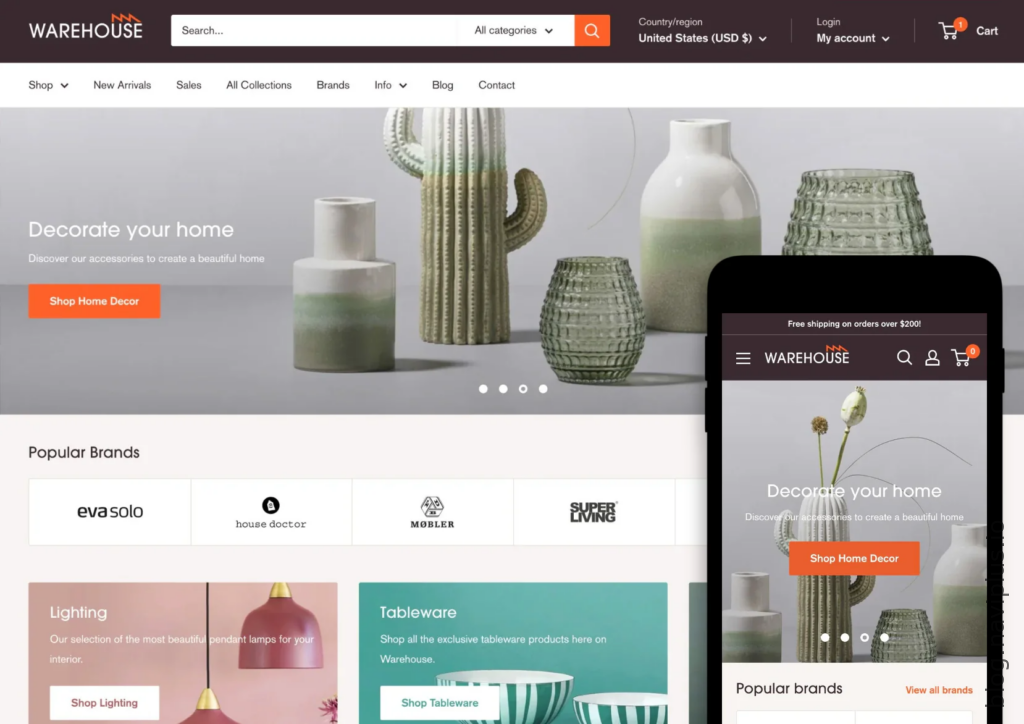
- Use responsive themes: Choose a Shopify theme that is fully responsive, meaning it adjusts seamlessly across different screen sizes. The Shopify theme store offers a variety of responsive themes that can be tailored to your brand.
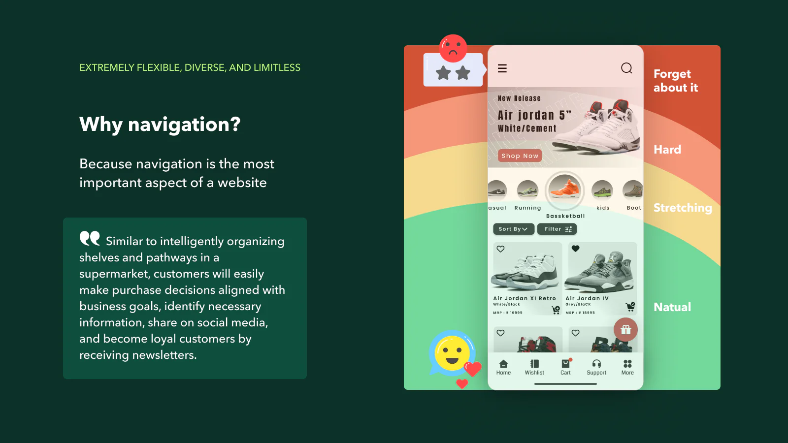
2. Optimize Navigation for Mobile
Navi+ is a powerful and user-friendly toolkit that enables you to create various navigation styles such as Tab bar, Drawer, Rail, Float button, and Menu, catering to each user's specific needs
Effective navigation is key to providing a positive user experience on mobile devices. Here are some tips to enhance mobile navigation:
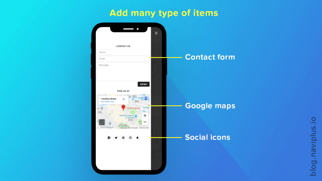
- Implement a hamburger menu: This compact menu style is popular for mobile sites as it saves space and allows users to access the main navigation options easily.
- Sticky navigation: Keep important navigation elements visible as users scroll down the page. This ensures quick access to essential parts of your site without having to scroll back up.
- Clear and concise labels: Use short, descriptive labels for your menu items to avoid overwhelming users with too much information.
3. Enhance User Experience with Touch-Friendly Design
Mobile users interact with websites differently than desktop users. Your design should accommodate touch gestures and ensure a smooth experience.
- Larger buttons and touch targets: Make sure buttons and links are large enough for users to tap easily without zooming in.
- Avoid hover effects: Hover effects that work on desktops won’t translate well to mobile. Ensure that all interactions can be completed with a tap or swipe.
- Streamline forms: Simplify forms by reducing the number of fields and using input types that bring up the appropriate keyboard (e.g., email inputs should trigger an email keyboard).

4. Focus on Fast Loading Times
Mobile users often have less patience for slow-loading sites. Here are some ways to optimize loading times:
- Compress images: Use tools to compress images without sacrificing quality. This reduces the amount of data that needs to be loaded.
- Minimize use of heavy scripts: Reduce the number of JavaScript and CSS files to streamline loading processes.
- Leverage lazy loading: This technique delays the loading of non-critical resources (like images below the fold) until they are needed.

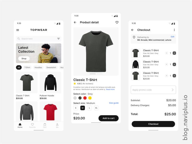
5. Perfect Your Product Pages
Product pages are where conversion happens. Ensuring they are optimized for mobile is crucial.
- High-quality images: Use high-resolution images that can be zoomed in on mobile devices. Ensure they load quickly to maintain user interest.
- Clear call-to-action buttons: Make sure “Add to Cart” and other call-to-action buttons stand out and are easy to tap.
- Detailed product descriptions: Provide all necessary information in a concise format. Use bullet points to make the text more digestible on smaller screens.
6. Leverage Mobile Payment Options
Make the checkout process as easy as possible by integrating mobile payment options.
- Multiple payment methods: Offer a variety of payment options such as Apple Pay, Google Wallet, and other mobile payment gateways.
- Simplified checkout process: Reduce the number of steps in the checkout process. Consider implementing a single-page checkout to minimize friction.

7. Test and Iterate
Finally, constantly test your mobile site to ensure it meets user expectations.
- User testing: Regularly conduct user testing to gather feedback on your mobile design and identify areas for improvement.
- A/B testing: Experiment with different layouts, buttons, and navigation styles to see what works best for your audience.
- Analytics: Use tools like Google Analytics to monitor user behavior and make data-driven decisions to optimize your site.

Conclusion
Designing a mobile-friendly Shopify site is not just about aesthetics; it’s about creating an intuitive, fast, and enjoyable shopping experience. By following these best practices for Shopify theme development and focusing on mobile navigation and design, you can ensure your Shopify store stands out in a competitive market. Remember to continuously test and refine your site to keep up with evolving user preferences and technological advancements. Happy designing!
Navi+ is a powerful and user-friendly toolkit that enables you to create various navigation styles such as Tab bar, Drawer, Rail, Float button, and Menu, catering to each user's specific needs
By implementing these strategies, you’ll be well on your way to mastering Shopify website design, creating a seamless and engaging mobile shopping experience for your customers. Whether you’re starting from scratch or looking to improve an existing site, these tips will help you achieve your e-commerce goals.